15 Most Beautiful Games of 2019 | Game Rant
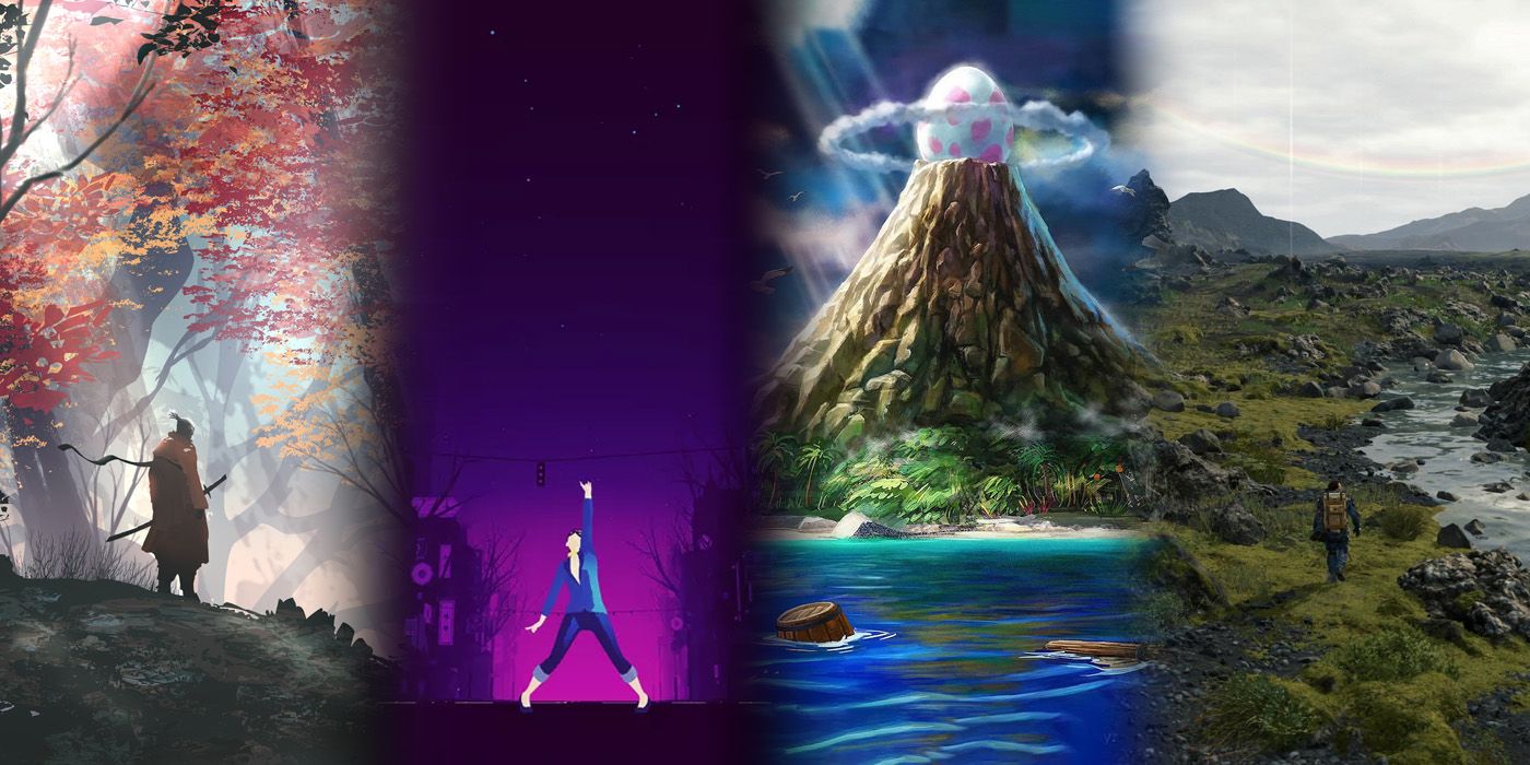
2019 saw the release of an overwhelming number of great games in an ever more competitive market. Amid all the big-budget blockbusters and hidden gem indie games, developers must constantly push the visual boundaries of their games to stand out. As graphics technology improves to the point where pure realism is less and less impressive, artistic license and unique visual styles can potentially create a timeless look. Video games as a medium are maturing, and titles that can push the boundaries of the medium will make a much more lasting impression than those that stick to the same old visual language.
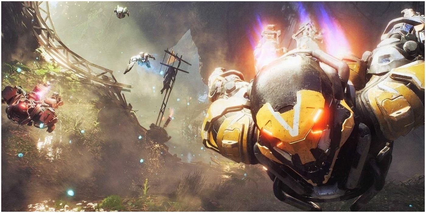
Anthem was one of the biggest disappointments of the year. It was a game that appeared truly next-generation and turned into a rushed letdown. However, what got so many people so enthusiastic about the game in the first place was its visual appearance.
It has bright, appealing colors reminiscent of a Marvel movie combined with a gorgeous open world. Every corner of the vast environment was lush with strange vegetation and unique creatures, while players were encouraged to soar through an intensely vertical landscape in customized mech suits. The landscape, creatures, and areas are all totally alien in a very evocative way. This is enough for many players to keep exploring the game as Anthem gets slowly patched into a more polished experience.
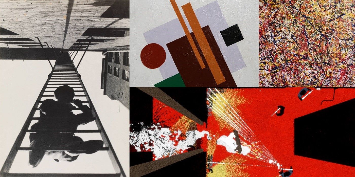
Ape Out has a remarkable appearance for a game that is ostensibly about a gorilla escaping captivity and fighting the security guards. However, in such a simple premise and short playtime, it not only provides a satisfying power fantasy, but also a wealth of artistic comparisons. Its dizzying vertical camera angles and oblique lines evoke the photography and art of Russian Constructionist Alexander Rodchenko, while the player slowly turns each environment from a work of geometric abstraction into an Expressionist drip-painting ala Jackson Pollock using only the gore of their slain enemies.
For all its lofty visual appeal, Ape Out succeeds because its presentation is clear, simple, and easy to read even as the action becomes frenetic and messy.
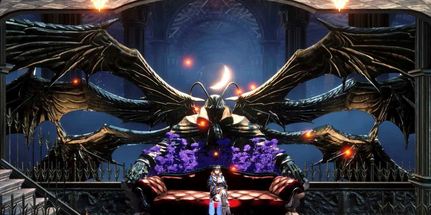
Bloodstained: Ritual of the Night may best be described as “Candy Gothic.” People who are familiar with vampire-themed media will be well acquainted with the game’s ornate, gothic stylings. However, while the dark and brooding architecture pays a respectable homage to Castlevania, a touch of rococo is added by the bright, soft bubblegum pink and purple hues that define the game’s palette.
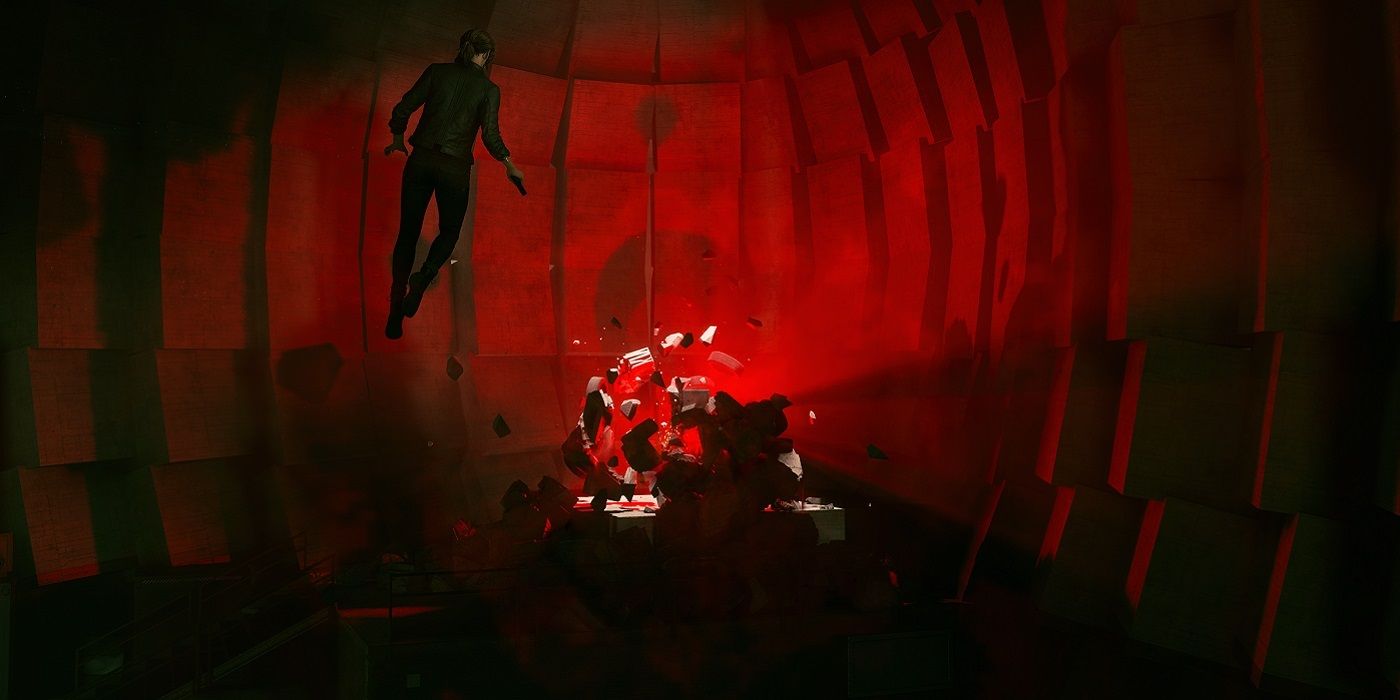
Control was a phenomenal narrative experience but is also, unsurprisingly, an Art Direction nominee for the 2019 Game Awards. The Oldest House was inspired by Brutalist architecture— a style named after its use of concrete as an inexpensive material for the masses. It is clean and utilitarian, but made ominous and foreboding by the otherworldly horrors that have occupied The Oldest House.
The blank walls are made even more expressive by the robust environmental destruction mechanics of Control. After any fight, the once-plain walls of the room are scarred and destroyed by the player’s actions. The canvas-like quality of the game environment serves to make the player feel powerful and gives every action by enemies or the player weight.
At the same time, the geometric concrete shapes of The Oldest House lend themselves to the surreal warping that brings Control’s psychological horror to life. The twisting mutilation of the ominous, blocky environment evokes all the feelings of a bad dream in just the right way to bring out a morbid curiosity and compel the player to see the story through to the end.
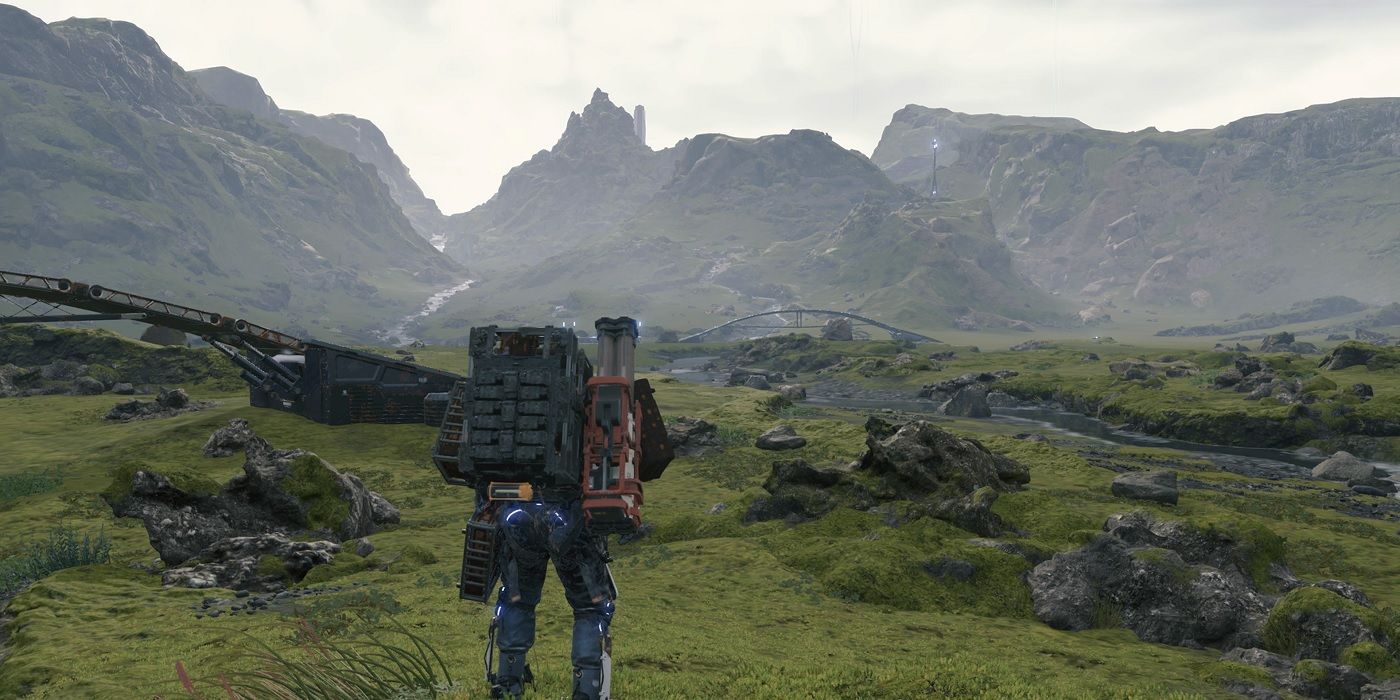
Death Stranding was also a nominee for Art Direction at The Game Awards, but for very different reasons. The game has a photorealistic style that accentuates its vast open landscapes and bleak natural beauty. These broad vistas serve to drive home the huge distances that players walk for each mission and give the player a sense of loneliness and isolation. This feeling of loneliness makes the helpful ladders and bridges left behind by other players all the more significant, and in a similar way strange, supernatural events break up the stark realism of the game’s natural landscapes.
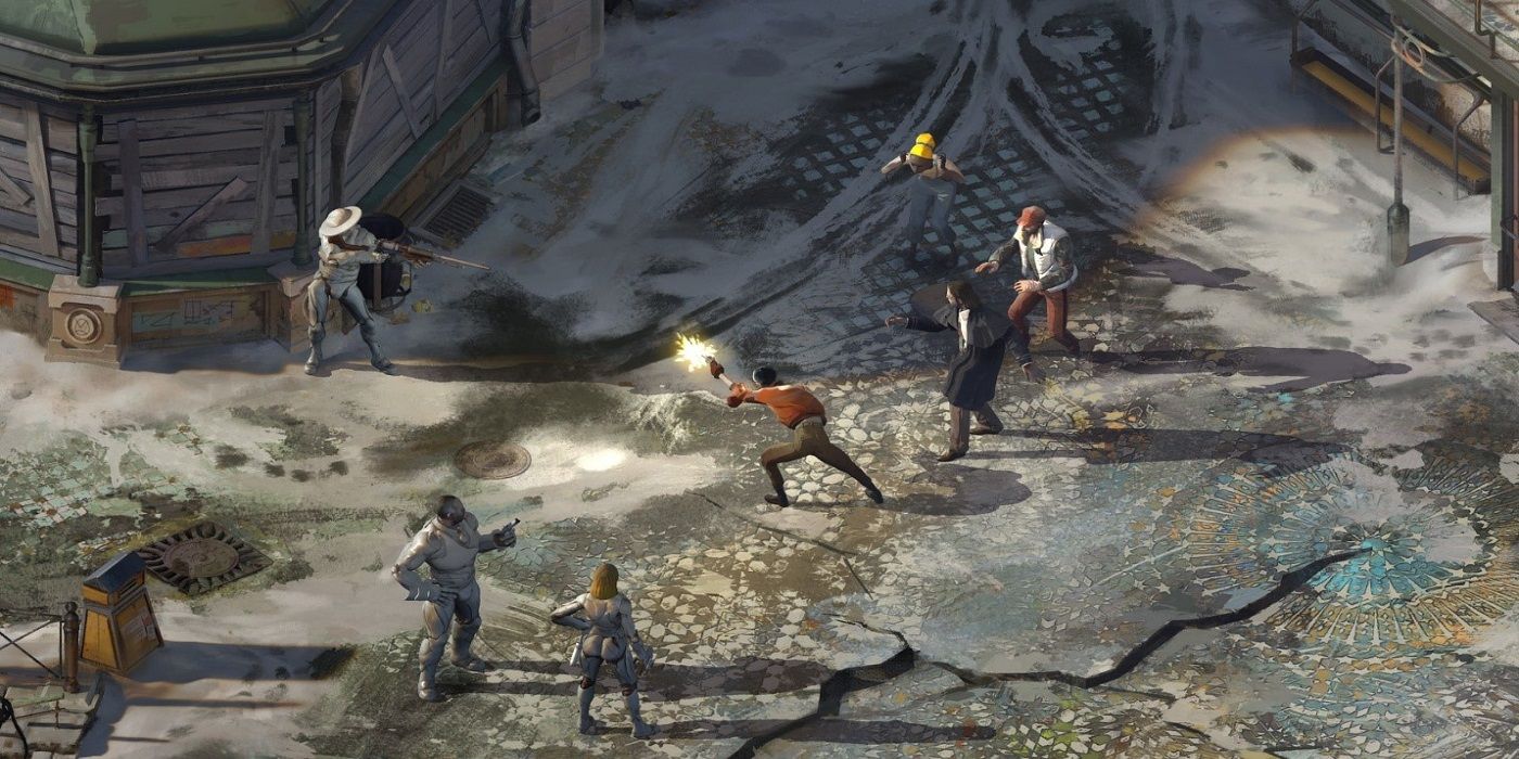
Disco Elysium is a sleeper-hit RPG that is played entirely through dialogue options, text, and random rolls. Beyond its witty writing and noir soundtrack, it has an artstyle that belies its often quite comical gameplay. Muted smudges and broad paintstrokes make up each environment and character, creating something that looks like a mixture of Art-Deco and a somber version of Norman Rockwell’s Americana. The dim hues and muted artwork would lend themselves to a much more serious game, which just makes Disco Elysium’s dead-pan humor shine all the more.
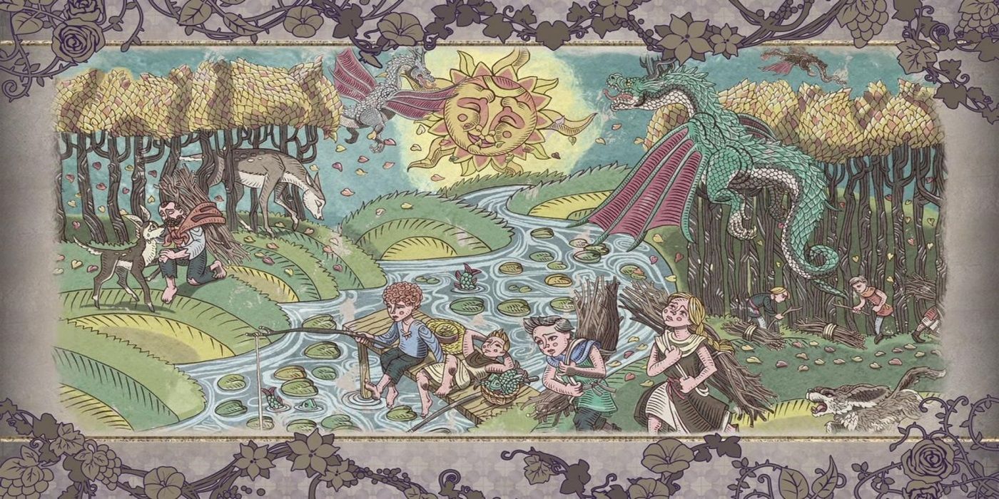
Fire Emblem: Three Houses was the first mainline Fire Emblem game to come out on a console powerful enough to support full character models and animation, rather than just sprites and pre-drawn artwork. As each season progresses in the game, gorgeous yet strange hand-drawn murals set the stage for the major story events to come with hyper-detailed lines and pastel colors. Fire Emblem games have always been about characters, with roughly 700 individuals appearing across all of the games. As such, the developers have mastered the art of crafting unique characters that can stand out in a crowd of figures and express their distinct personalities with clear, focused design. This is no more apparent than in Fire Emblem: Three Houses’ bright primary colors and unforgettable character artwork.

Gears of War games have always stood out with their gritty, burly style that immediately identifies any scene as belonging to a Gears title. Gears 5 upped the fidelity of this visual style to make for a truly impressive graphics experience. While gritty over-the-top realism may seem a bit boring at first, Gears 5 has some interesting takes on the style. Instead of a brightly colored protagonist standing out in bleak environments, it seems like the grim protagonists pop in the bright, monotone environments of white snow and red sand.
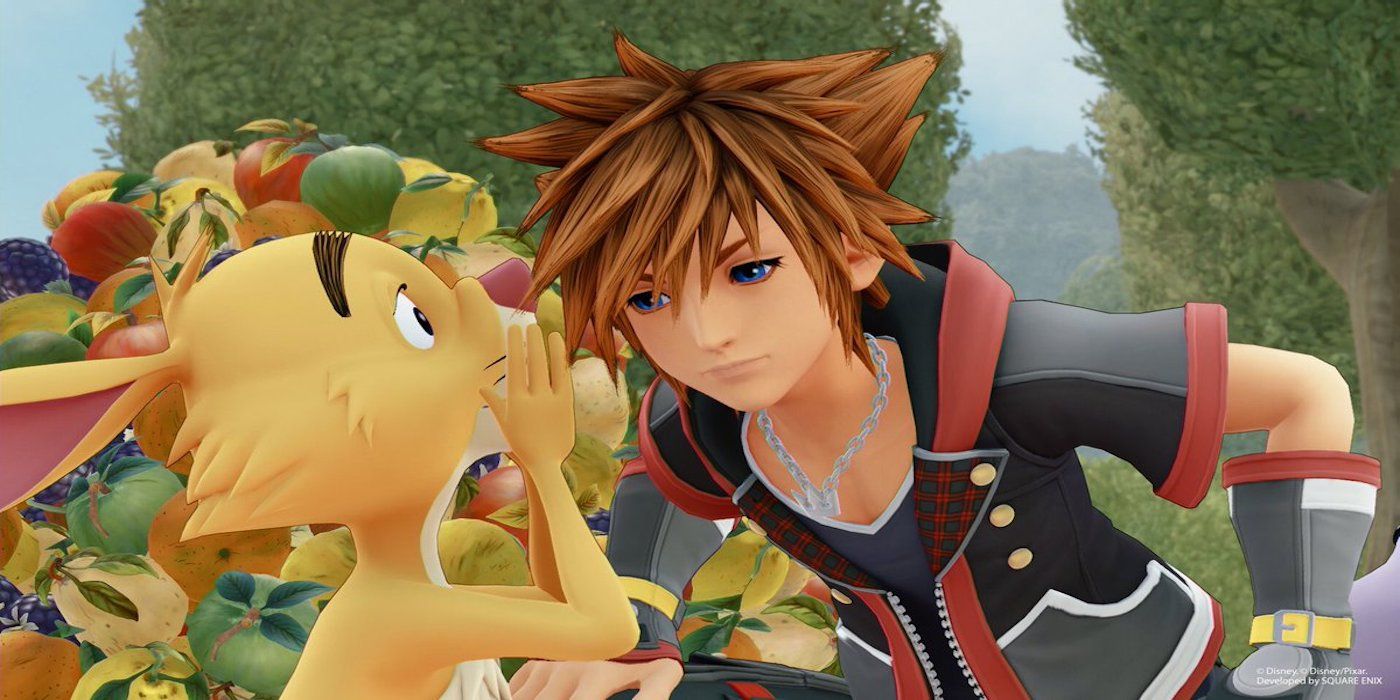
Kingdom Hearts 3 was one of the biggest titles of the year, and its visual style stood out as one of the highlights of the game. It is bright, vibrant, and cartoony in a way that compliments the story and themes of Kingdom Hearts splendidly. In a setting that includes such a wide variety of unique characters and well-known worlds, it is an accomplishment to create a game that can include everything without anything ever seeming out of place.
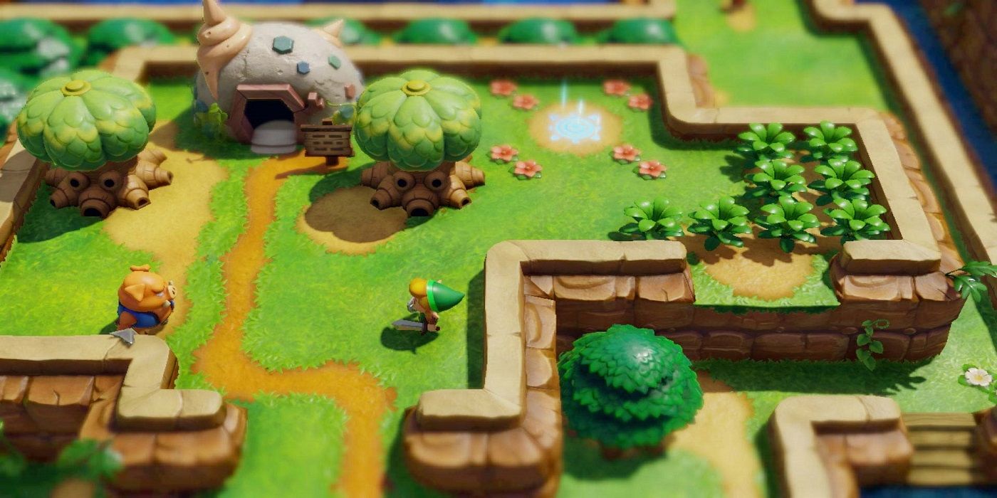
Link’s Awakening was another Art Direction nominee at the Game Awards due to its adorable, joyful, and naturally adventurous looks. The game exudes a lively spirit of discovery and fun with bright lighting and minimal shadow. Rich, clean colors make the game feel polished and beautiful while keeping everything on screen simple, clear, and readable. This is an example of a game that will look just as good years in the future as it does now.
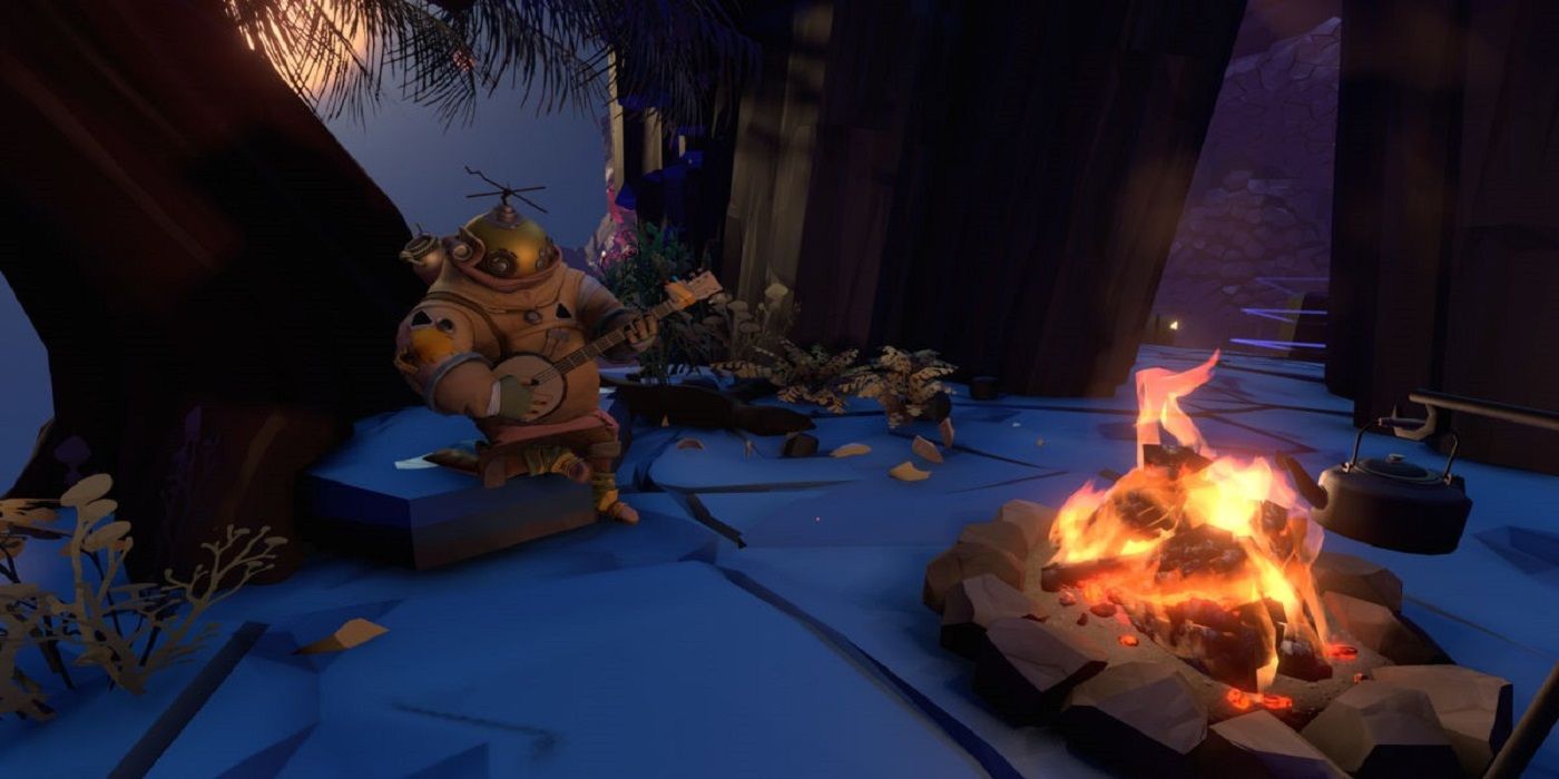
Outer Wilds was in the unfortunate position of having to compete with The Outer Worlds for notoriety, a challenge made even more difficult by the two games’ very similar titles.
However, Outer Wilds provides a lovingly-crafted visual style that is very distinct. It is colorful, yet still manages to be brooding and mysterious. Each different world is densely designed to create an air of awe and discovery in a game all about slowly uncovering a space-time mystery.
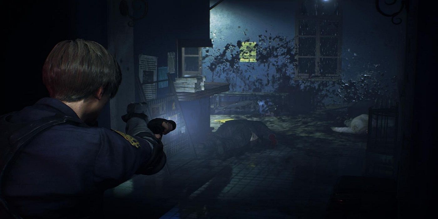
The Resident Evil 2 remake is an example of photorealism done right. The game’s brilliant strategic use of light and shadow allows every important detail to stand out dramatically, while keeping every corner dark enough for the player to imagine lurking danger. The sharp shadows and dull sheen of wet surfaces and hair make everything feel disturbingly too real, adding to the horror and tense atmosphere of the Resident Evil. The use of light and shadow to convey tension is on par with the best of black-and-white film composition, and it is so much easier to be scared when every zombie's gore is uncannily realistic.
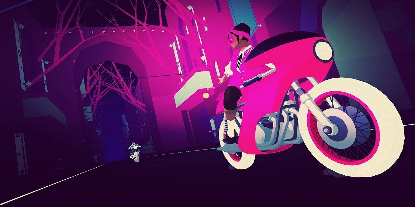
Sayonara Wild Hearts earned a Game Awards Art Direction nomination with its neon-punk dreamy grunge atmosphere. A palette of bright, complementing vibrancy evokes a clean Blade-Runner aesthetic with solid blocks of color and gentle gradients. Every frame could be a poster, and the sharp intensity of pinks, blues, and purples brings out the energy of the action and narrative.
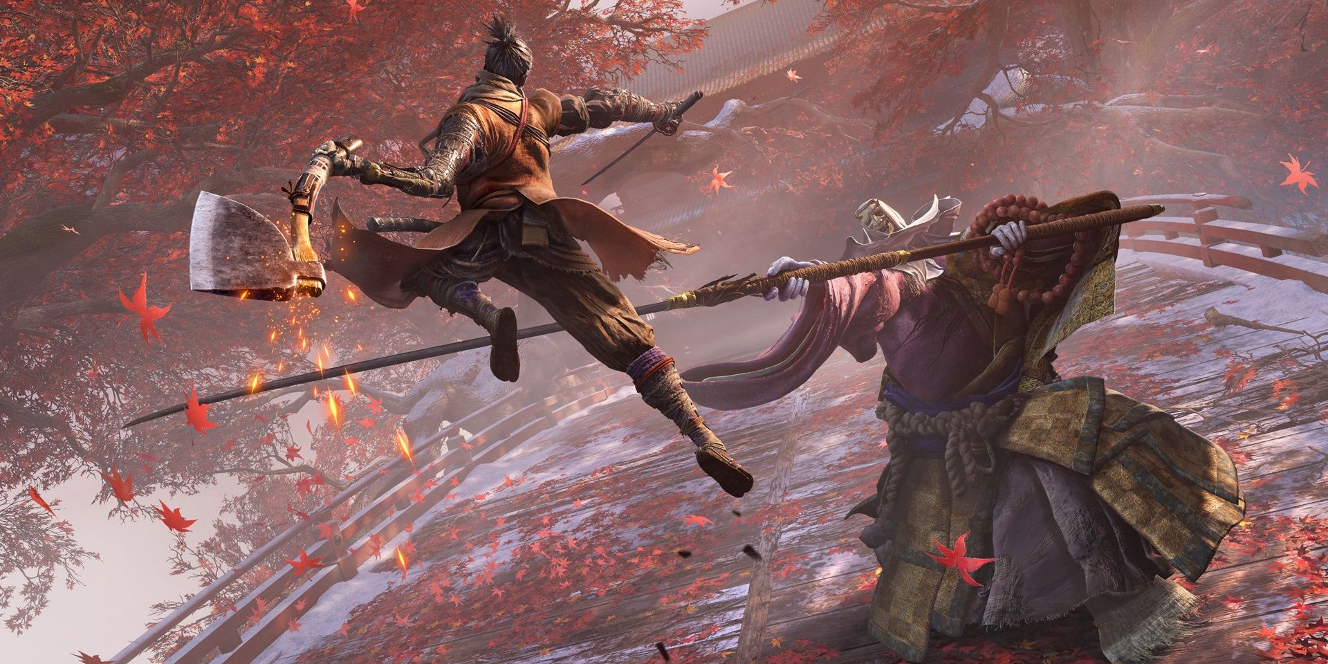
Another nominee for Art Direction at The Game Awards, Sekiro is a testament to FromSoftware’s design prowess. They have always excelled at dark fantasy level design, giving every major area of their games an overwhelming theme.
However, in Sekiro, the Japanese developer was able to play with architecture closer to home than the crumbling European landscapes of Dark Souls and Bloodborne. The bright orange protagonist stands out from the towering steeples of Ashina Castle, the poisoned grandeur of the Bodhisattva Valley, and the rotting ethereal waters of Fountainhead Palace. Every area stands out with its own unique beauty, and the newly vertical traversal allows for more breathtaking vistas than most games ever achieve.
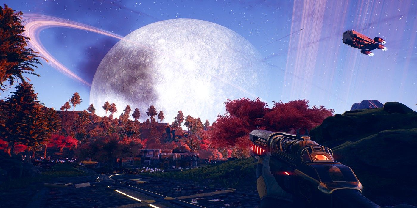
The Outer Worlds comes across as an evolution of everything that Obsidian has released up until now. For a studio that is primarily known for brilliant RPG stories, interesting characters, and lively settings, they also have made some stunning artistic choices in their games. The Outer Worlds is animated, retro, and colorful. It borrows the quirky 50s sci-fi of Fallout and combines it with the variety that can only come with a space-age setting. This is added to the rich, high-contrast colors of games like Pillars of Eternity or Tyranny to create a uniquely pleasing aesthetic for one of the best RPGs in recent memory.
Games offer a uniquely experiential artistic medium. Any artistic choice made by the developers is not just seen, but experienced as a part of ongoing interaction with a setting and narrative. This multiplies the impact of visual expression, which has the potential to make a game a timeless classic or boring flop. The variety in art direction for games will only diversify over time, to the direct benefit of anyone who plays them.

Post a Comment