Steam rolls out even more convoluted ways to browse its games
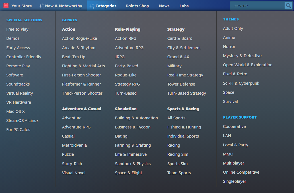
Valve has added yet more ways to browse through the massive pile of games offered through Steam with the addition of a "New and Noteworthy" dropdown menu and more detailed game categories based on "navigational entry points" built around genres, themes, and player modes.
The new features were actually introduced in December 2020 as an experimental option in Steam Labs. But now it's been rolled out to all users, in the menu bar at the top of Steam's front page. The New and Noteworthy dropdown rounds up categories including Top Sellers, New and Trending, Current Specials, Recently Updated, and Popular Upcoming, making them all available in a single location.
But it's the new Categories, which breaks down into genres, themes, and player support, where things get really granular. Under Role-playing, for instance, you can now narrow your options to Action RPG, Adventure RPG, JRPG, Party-based, Roguelike, Strategy RPG, or Turn-based. If Strategy is more your thing, new sub-categories include Card and Board, City and Settlement, Grand and 4X, Military, Real-time Strategy, Tower Defense, and Turn-based Strategy. Once you've selected a category, you can winnow your choices down even further with tags.
Themes are a broader take on Steam's selection, including things like Adult Only, Anime, Horror, and Pixel and Retro, while Player Support is more mechanical, providing options for browsing co-op games, for instance, or LAN, MMO, or singleplayer. Valve said that each of the three "entry points" are modeled after the way people generally browse Steam already.

"These player motivations can be organized and expressed using Steam tags and metadata," the new blog post says. "Categories grouped under the Genres and Themes entry points are defined by tags, whereas categories grouped under Player Modes are defined by additional metadata provided by the developer."
"We arrived at these three top-level categories through a mix of formal research, intuition, and beta feedback. There’s also strong precedent for this scheme on Steam itself in the form of Steam Curators. We noticed many curators are building lists of specific types of games, almost all of which fall under one of the above three patterns: Gameplay and genre-based lists like City Builders, theme-based lists like Games with Dogs, or player mode-based lists like Games to Play with Your Significant Other."
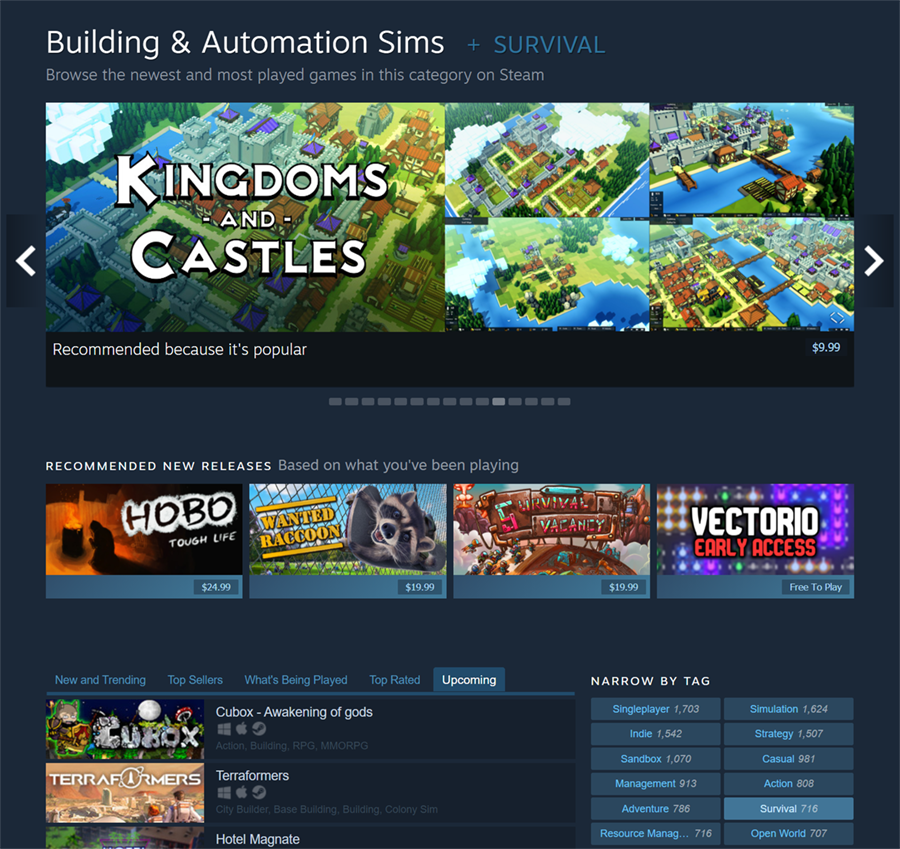
Each of these views also now has its own content hub, such as New & Trending Strategy Card & Board Games, Top-Selling Singleplayer Adventure Role-Playing Games, or Top-Played Story-Rich Sci-Fi & Cyberpunk Games. All of them are accessible directly via its own URL so users can easily bookmark and share them, and each hub has its own tabs for New and Trending, Top Sellers, What's Being Played, Top Rated, and Upcoming, along with standard genre tabs for further filtering.

"Clicking on any of these will take you to a sub-view of the content hub. In the illustration above, we’re viewing Building & Automation Sims, but now we’re viewing only those which also include the Space Sim tag. Each of these sub-views gets its own unique URL too," Valve explained. "Viewers can return to the parent category any time by toggling the filtering tag previously clicked, or by clicking another to display a different sub-view of the category."
I know this is supposed to simplify the process of browsing Steam and make its massive selection of content more accessible, but man, that's a lot to take in. I feel like I'm reading a manual for Microsoft Excel.
Anyway, Steam's new, incredibly detailed, and slightly confusing browsing system is live now. Give it a shot!

Post a Comment